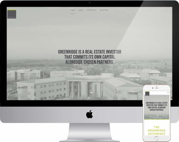
Greenridge Investments
Their website had reached a stage of not quite reflecting that reputation and being less than usable on modern devices. Replacement needed, to serve an audience not stimulated by doubt, or inconvenience.
Our task was to build a website which would be clearly on subject and a place where people wanting to invest large sums felt welcome.
Technical & Search – Although a little dated, the previous website reflected a company with an eye for detail and had been well maintained.
The core requirement was to ensure the new site also demonstrated quality, in terms of technical construction and smoothness of use.
WordPress is a popular and effective content management system, yet not finely tuned out of the box. We made sure visitors had a good experience, regardless of device, or connection.
Conscious and unconscious bias subtly, or significantly change the view we believe we see. A complex product of evolution and experience, which a designer should consider.
In this case, a refined, modern take on traditional grey and gold fitted perfectly. Headers, fonts and functionality chosen to match.
Outcome – Our clients felt the website reflected their business well and more importantly, so did their clients.
Brasher, or stronger would have been easy to fall into but not the approach substantial investors would find comfortable.
By all means view more examples of our work. if you came straight to this page, see further options in our introduction to web design. Or get in touch, if you would like to discuss your own web project.